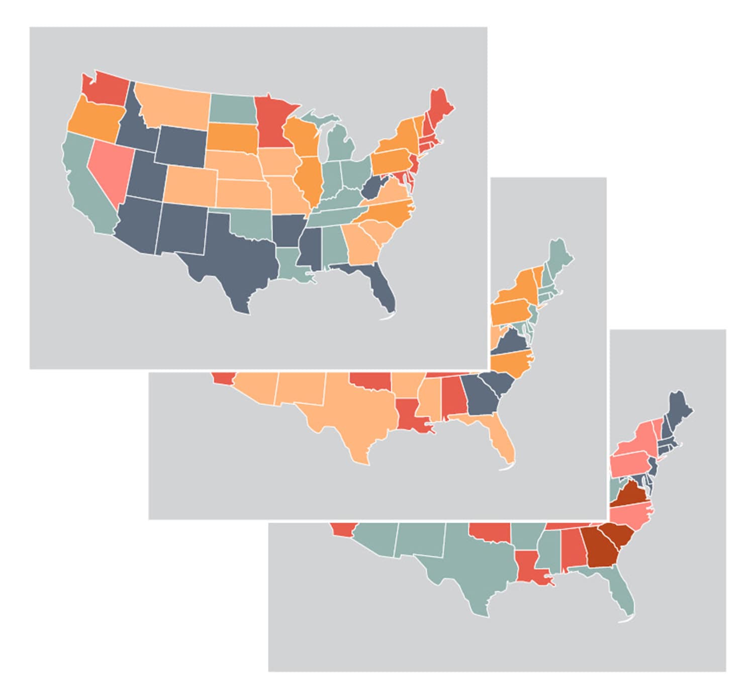
Take a look at the map stories created by the National Cancer Institute (NCI). The intelligent web maps use Geographic Information Systems and science principles and tools to draw out comparisons from large state data sets.
The NCI website currently has map stories on cancer incidence and death rates for breast, cervical, colorectal, lung and prostate cancer. There are also map stories on breast and colorectal cancer screening rates. Want even more detailed information? Use the online zoom feature to look at rates for each county within a state. Or click on the “Interpret” tab to learn about possible explanations for the variations you see.
Cancer Today magazine is free to cancer patients, survivors and caregivers who live in the U.S. Subscribe here to receive four issues per year.